International Design Day
The Spaces in Between
Each year, on 27 April, International Design Day is held to mark the anniversary of the establishment of the International Council of Design (ICoD) in 1963. Celebrated since 1995, International Design Day invites designers worldwide to gather, innovate and live out a moment of design by organising public initiatives and responding creatively to a set theme.
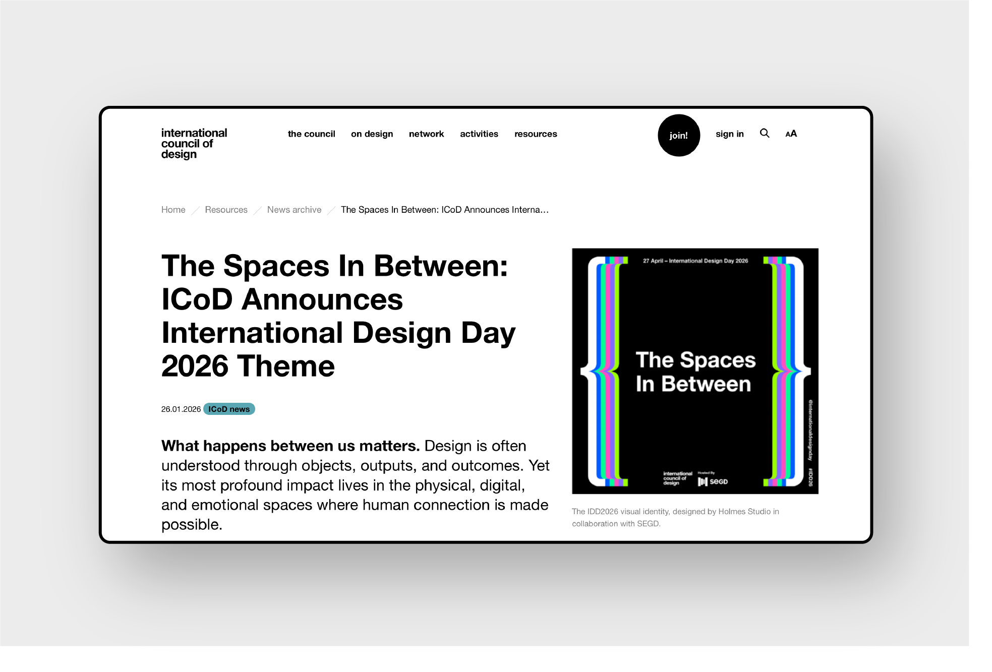
In late 2025, Holmes Studio were appointed to create the visual identity for International Design Day 2026 (IDD2026) and its central concept, The Spaces in Between. Selected by this year’s host organisation, the Society for Experiential Graphic Design (SEGD), we were tasked with creating a bold, striking and flexible design that could work across a range of social media formats and materials.
Exploring The Spaces in Between
As a concept, The Spaces in Between encourages participants to explore the “thresholds where ideas become experiences, where individuals become communities, and where design shapes how we…relate and coexist”. Focusing on connection and shared space, it invites designers, educators and changemakers everywhere to use creativity as common ground to create places where people belong.
Our challenge was to translate this broad concept into a flexible design system that would facilitate global participation and engage a younger generation of designers and thinkers.
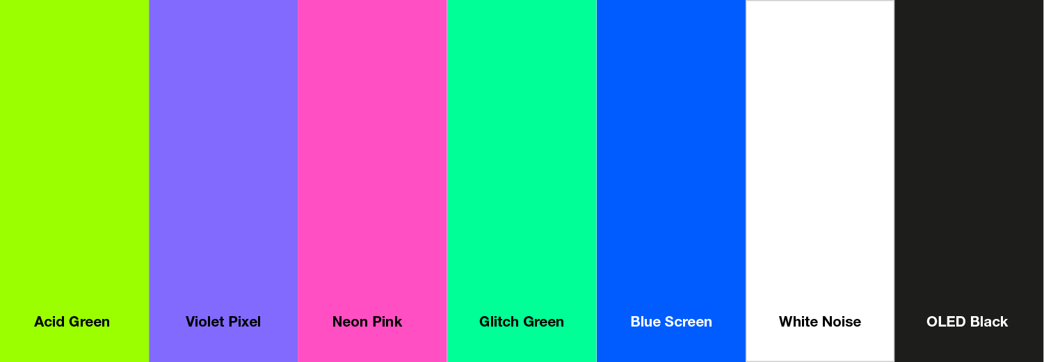
A digital colour spectrum
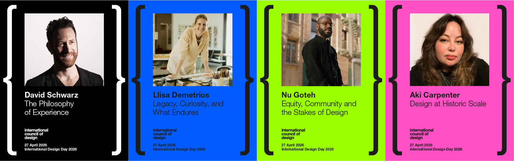
Establishing a striking visual language, this device also needed to adapt and allow the central space to expand and contract. So, we explored ways to stretch the brackets, introducing a bold colour spectrum which we used to pull the structure apart. Starting with a retro palette, we incorporated more vibrant and unusual colours, such as acidic greens and pinks. The idea was to convey ‘digital colour’ being pulled apart, like a faulty TV signal, to create additional space between the bracket parameters. We also wanted to generate sufficient brightness and energy to achieve cut-through with our younger target audience. The result is a powerful, impactful typographic design that issues a rallying cry to creativity.
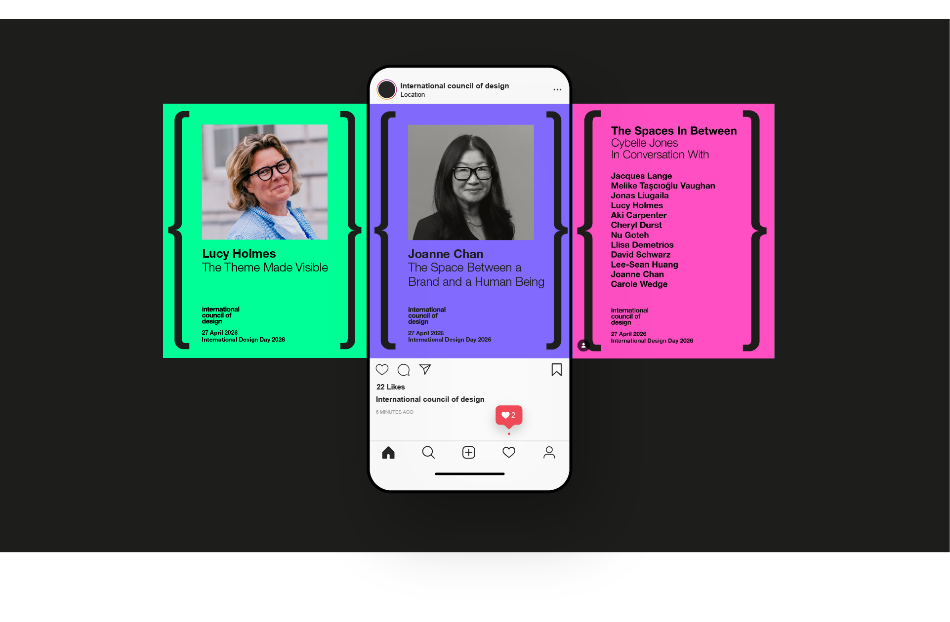
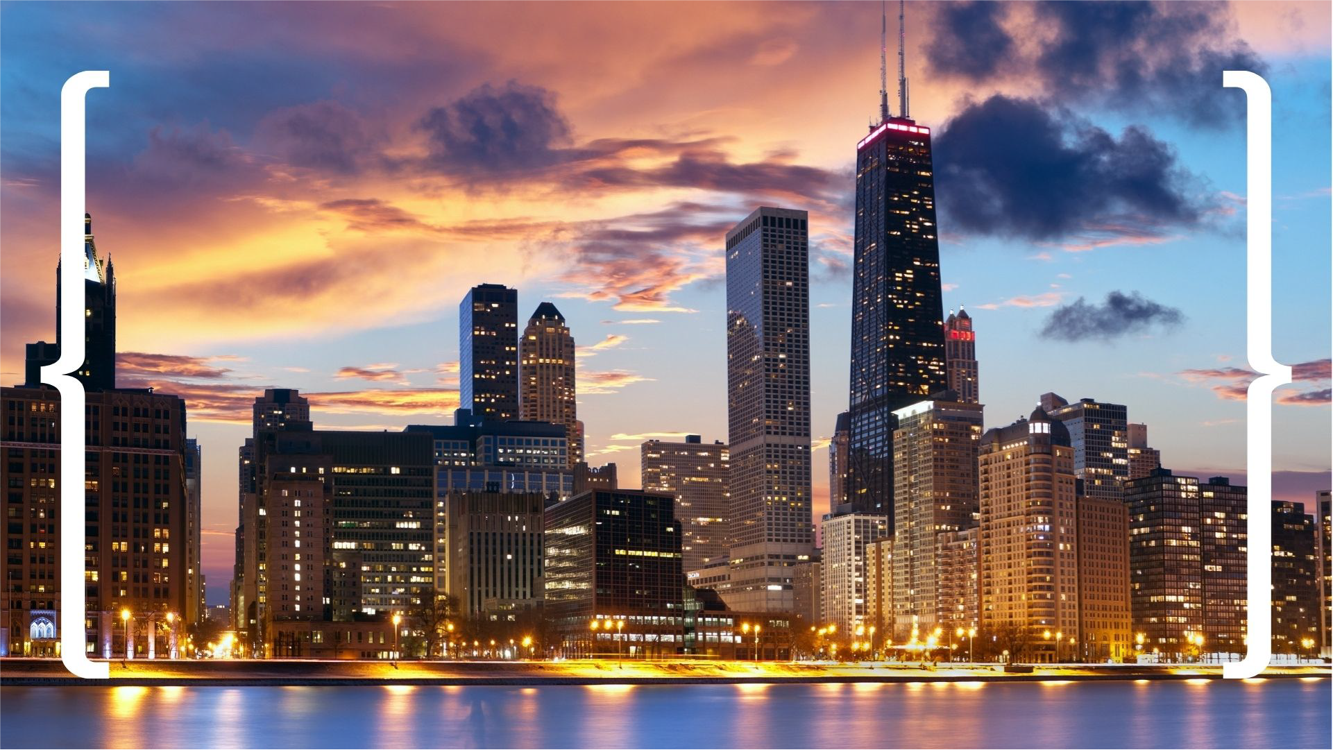
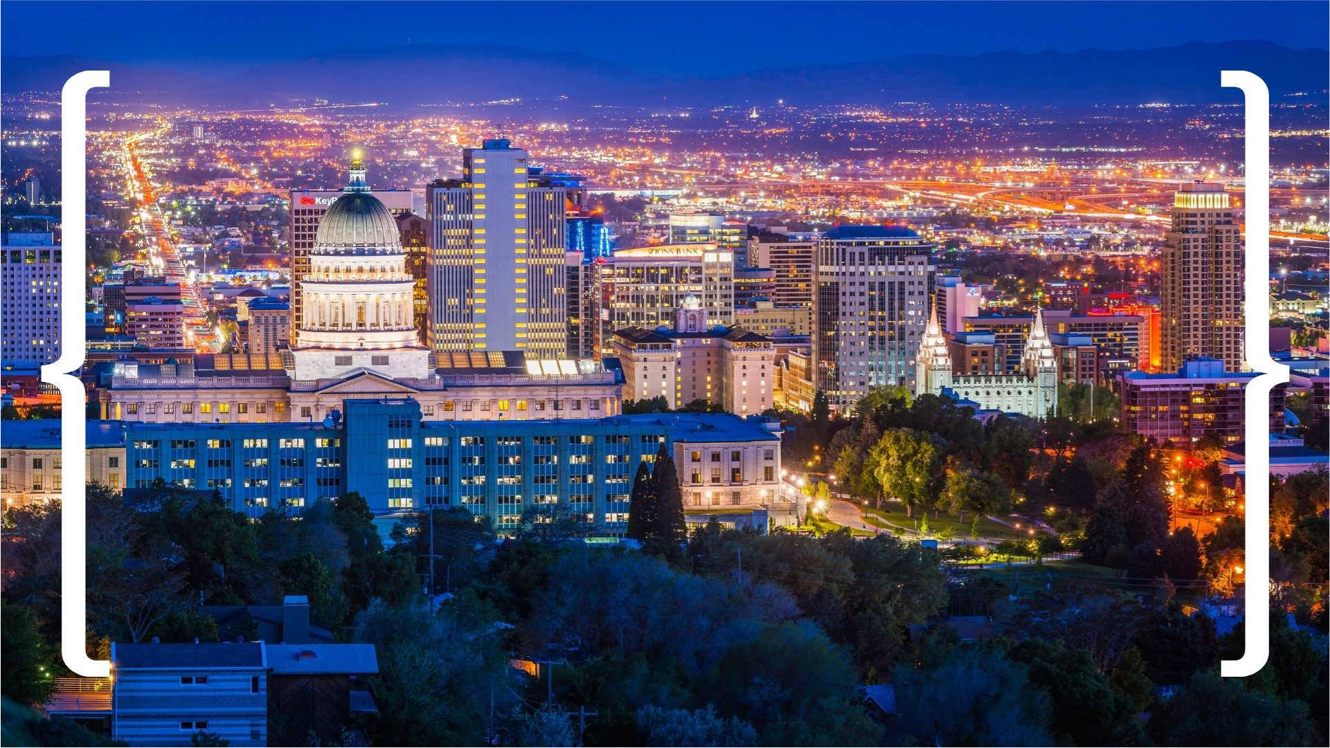
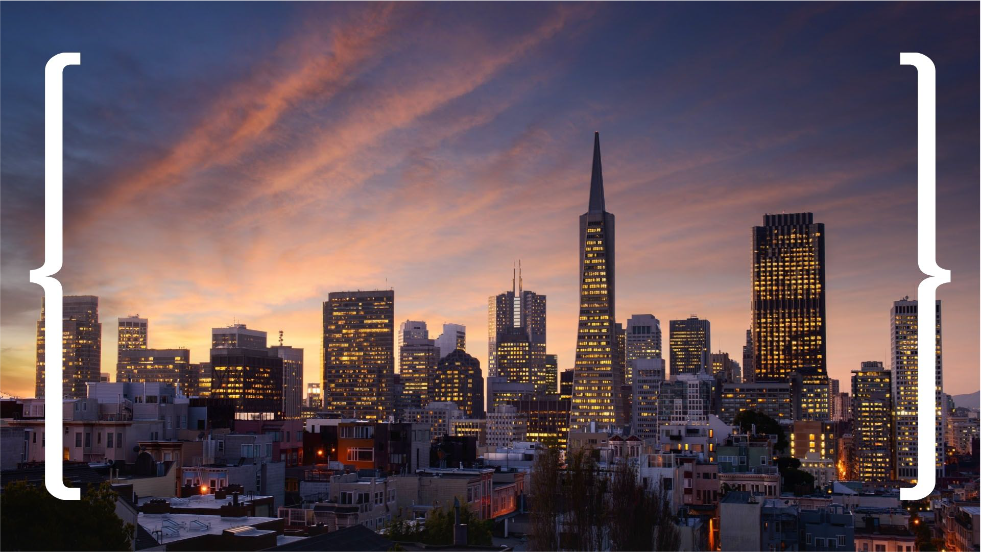
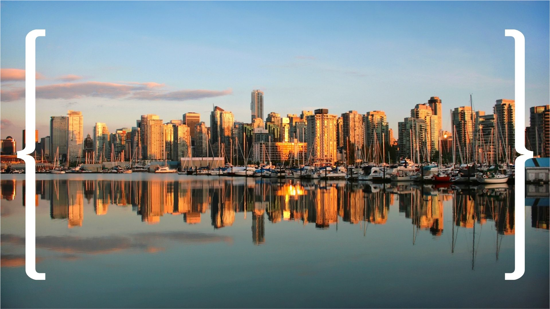
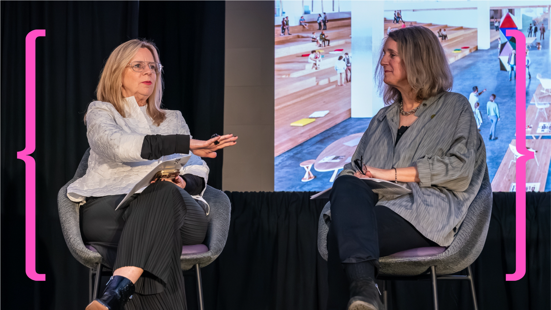
Brackets and boundaries
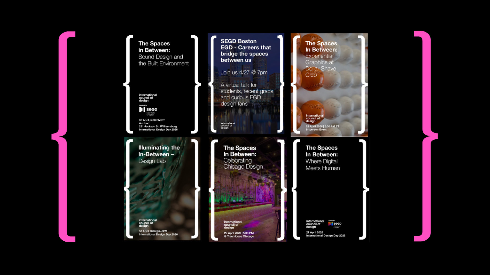
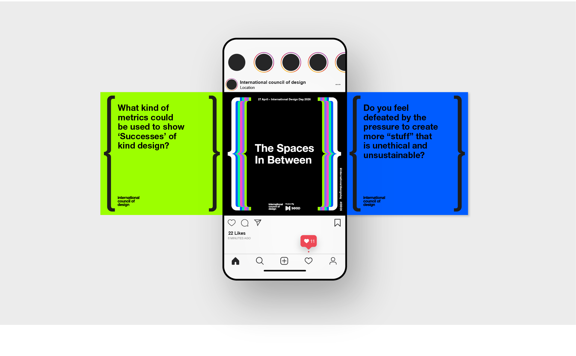
With the endless possibilities linked to this year’s theme, we decided to impose certain constraints on our creative approach. Focusing on graphics and typography, we began to explore the use of brackets, which are used in text to clarify meaning by directing attention to the space between their boundary walls. Given their role as structural delimiters, defining space and qualifying intent, brackets seemed the perfect typographic device to articulate IDD2026’s central concept. Opting for the ‘curly bracket’ or ‘brace’ symbol, we created a bold white outer framework for the core visual identity, with the words ‘The Spaces in Between’ contained within.
Supporting a global movement
One of the unique aspects of this project is that our work not only defines IDD2026’s visual identity, but can be incorporated as an active component within the event’s initiatives. Both a logotype and tool, our design provides a fully adaptive mechanism whose central space can flex (horizontally and vertically) to accommodate text, images, animation and more. It’s also applicable across posters, banners, Instagram posts and other social channels.
To facilitate engagement and uptake, we created a range of Canva design files and Illustrator templates which participants can access via a full-packaged IDD2026 toolkit. Working with our original concepts, designers around the world are able to devise their own creative response to The Spaces in Between. Our visual design gives participants a blank canvas for expression, providing – quite literally – the space into which they can project their own interpretations of this year’s theme.
In this way, our work is supporting a global design movement and moment, helping to celebrate ideas of connection, community and co-existence all around the world.