

Clinical excellence and effortless style
When we were appointed it became clear to us that we needed to spend some time with the ophthalmologists to learn about the science behind their work. We had our eyes tested while being talked through the reason behind each part of the process. It was fascinating to hear how certain colours could be used to identify certain issues with the eye.
They not only offer exceptional eye care, they also have professionals on the shop floor to ensure you choose the right frames (it is all about the position of your ears and eye brows), that they suit you, that they fit and the lenses are made in the correct configuration.
Light as colour
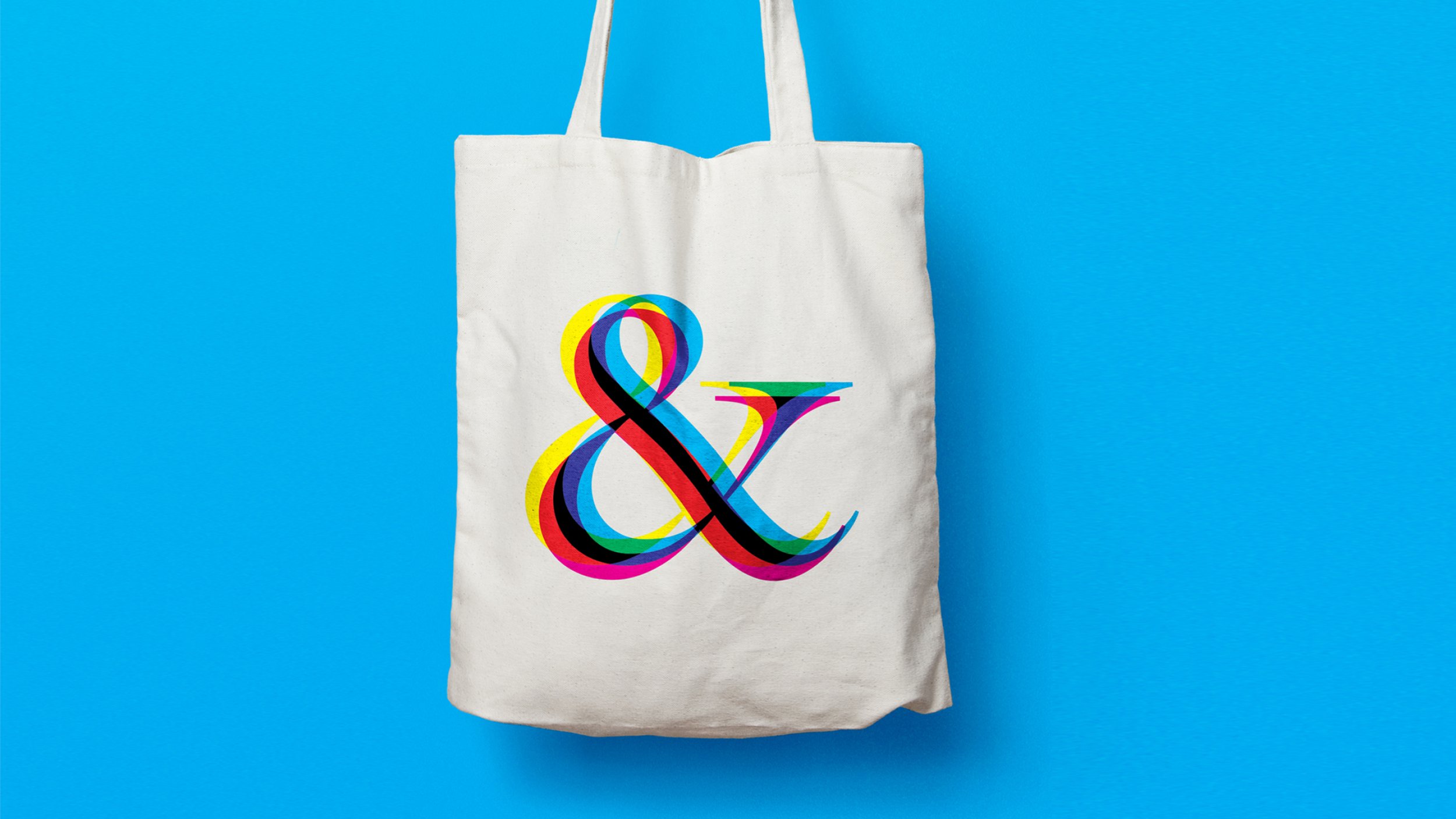
At the core of the identity is the play between different colours in the spectrum and how they interact with each other. In print our tools are CMYK (cyan, magenta, yellow and black) when they overlap we make black. For digital the colours overlap to create white. This is a defining factor in our work for the different outputs.

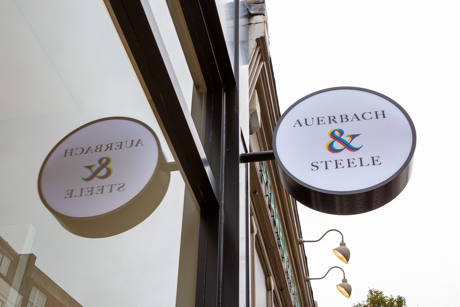
Ampersand
The name of the business comes from the founding partners surnames. By changing the scale of the words we could create a symbol that could begin to represent the business despite the names. They are ahead of most in terms of the patient offer – the visit is carefully curated and Gail, the founder, wants our work to celebrate this. Using the ampersand we could express much more about their duality – fashion & science – style & experience etc…

Fun & quirky
They make no secret of the fact that their frames and lenses are an investment. We introduced the idea of your ‘optical wardrobe’. As an extension of the care the packaging was also an important consideration. We activated the brand across a set of gifts that any customer would receive as part of their purchase.
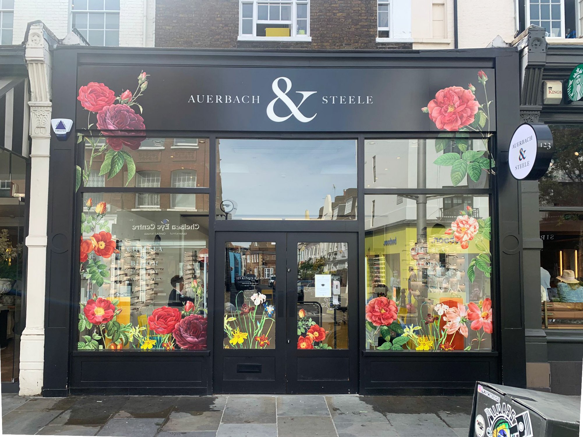
The new brand was launched with the new store that was created. We were part of the team to bring the brand to the built environment. The sign outside the shop on London’s famous King’s Road is one half of a pair of glasses – the reflection in the shopfront glass completes the pair.

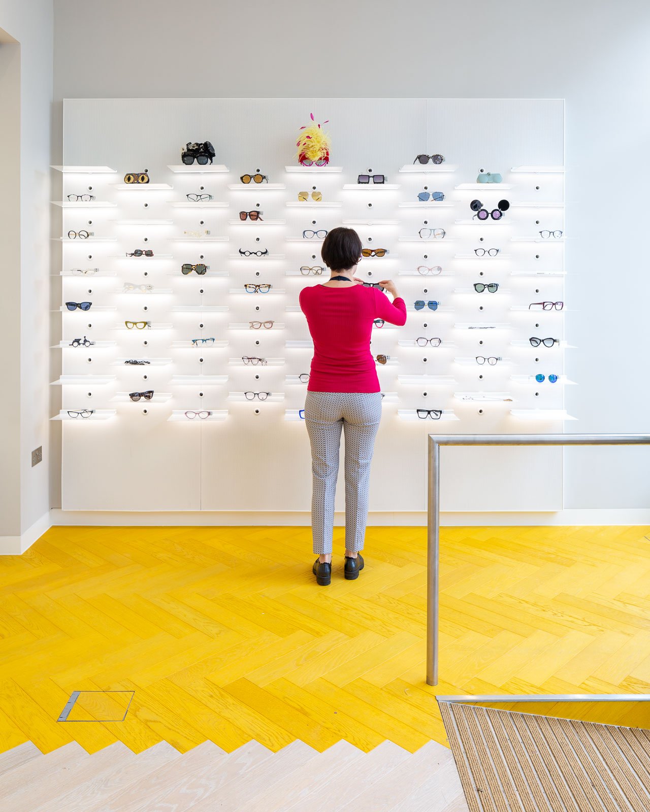


The digital optical house
The new store is spread over four floors, which is not at all obvious from the street. We presented their offer as a colourful ‘optical house’, treating the space like a department store.
“We like to think of ourselves as no ordinary opticians. Our site needed to reflect that, showcasing our beautiful new store, illustrating the breadth and depth of our offer whilst ensuring there was still a very human feel to our practice. We think the team at Holmes Studio have interpreted the brief perfectly and have created a site that truly sets us apart from the competition.”
Gail Steele, Founder of Auerbach & Steele.
