
We are Sunday
The four founders got together on a Sunday to agree the name of the business… They are a multi-award winning content marketing agency, working for world-class clients across print and digital channels, from magazines to brand videos and content strategy. Our scope was to work closely with them to hold up a mirror and create a new visual identity to reflect their personality now and celebrate the team and work.
The nostalgia of ‘Sunday best’
We love the fact that they are called after the day of the week traditionally set aside, in most cultures, as a day of rest. We explored avenues of what Sunday means and landed upon ‘our Sunday best’. Sunday best underpins the tone of voice across all outputs and showcases the craft and the detail that sets them apart from the rest.
Sunday knows best.
Sunday will give you our best.
Sunday is your best chance.
Sunday does the best work for the best clients.
Sunday chooses the best solution.
We always do our best.


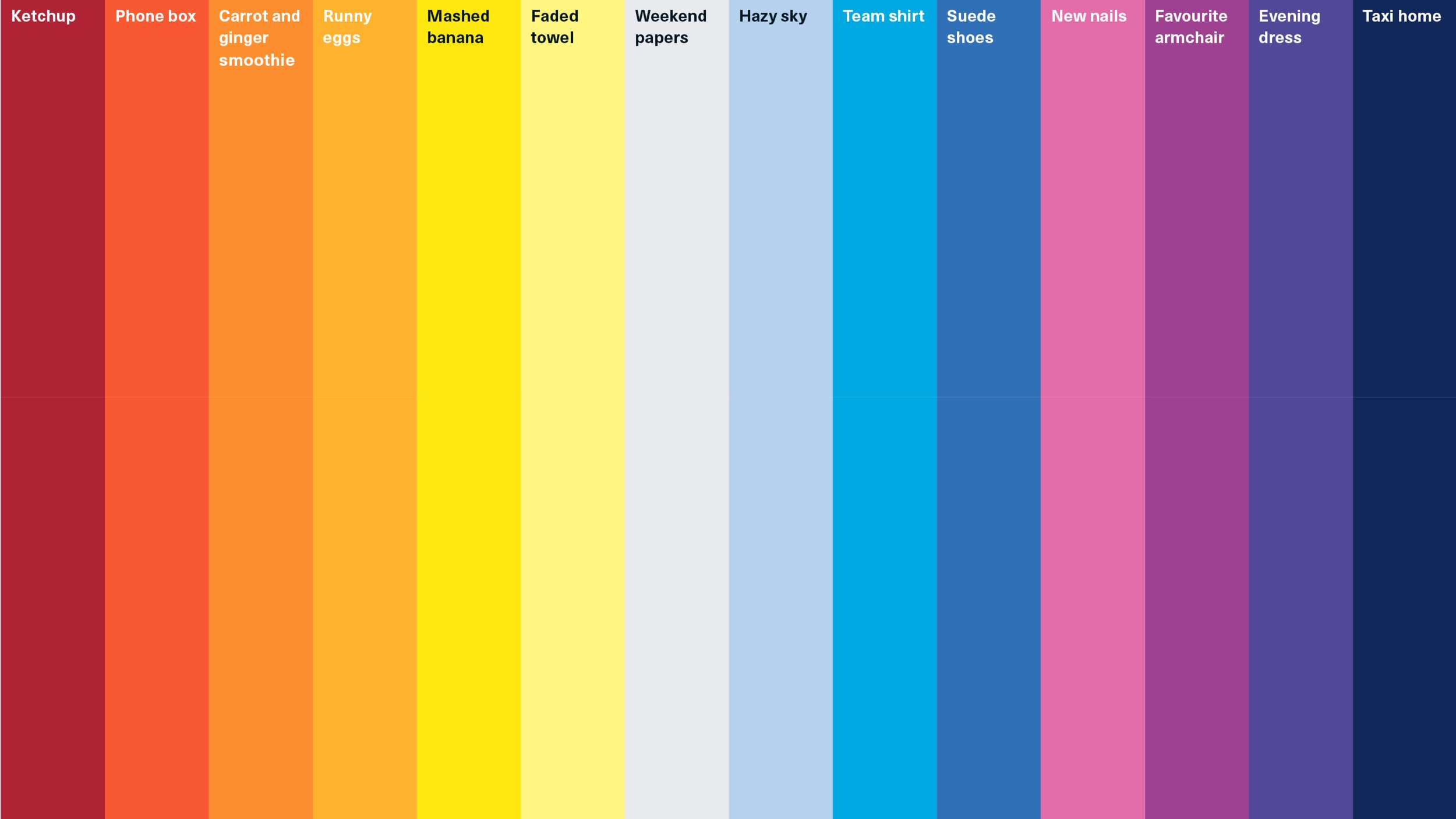

Always on a Sunday
Every aspect of the visual identity was built from the seven days of the week. Previously the colour palette had been limited. It didn’t let them showcase the diversity of their client base and breadth of work. When we met the team, albeit in zoom, they are fun and behave like a family – we thought about colours as an extension of the team. The split of the letters S U N D A Y helped change the perception of the word and frame their proposition.