
Making Paul
Introducing a brand new digital identity for our fellow creative and good friend, Paul Hanegraaf.
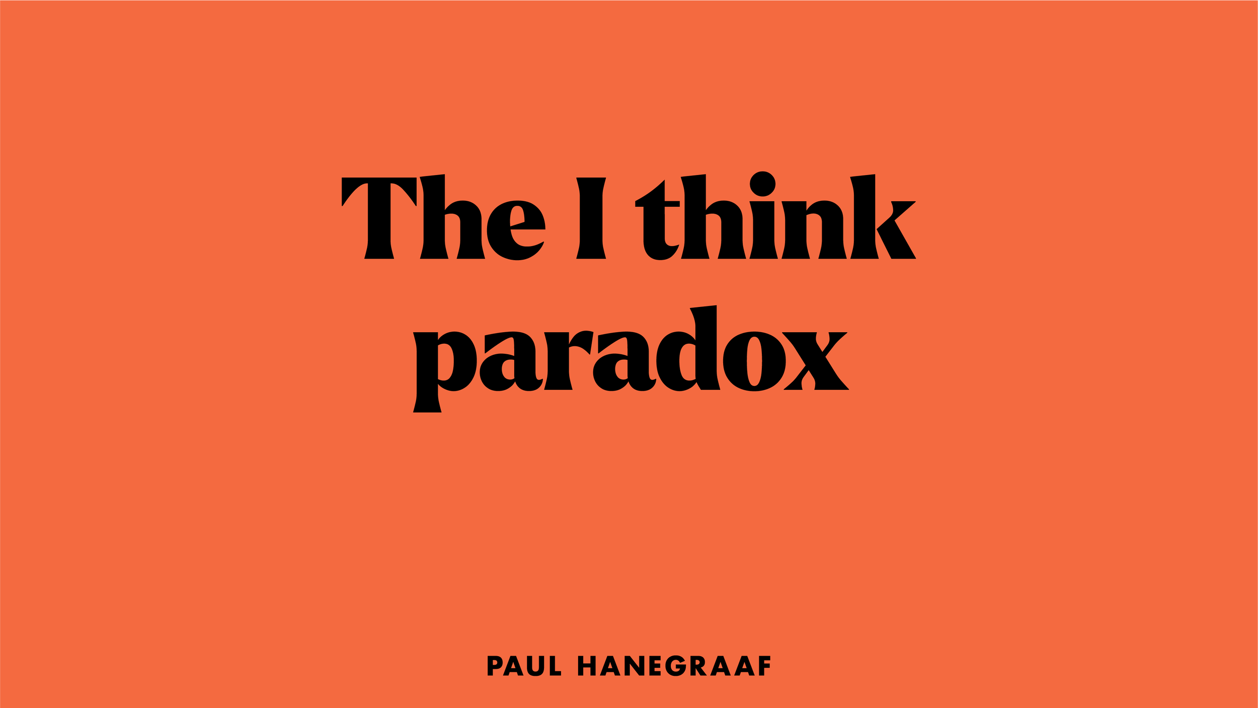
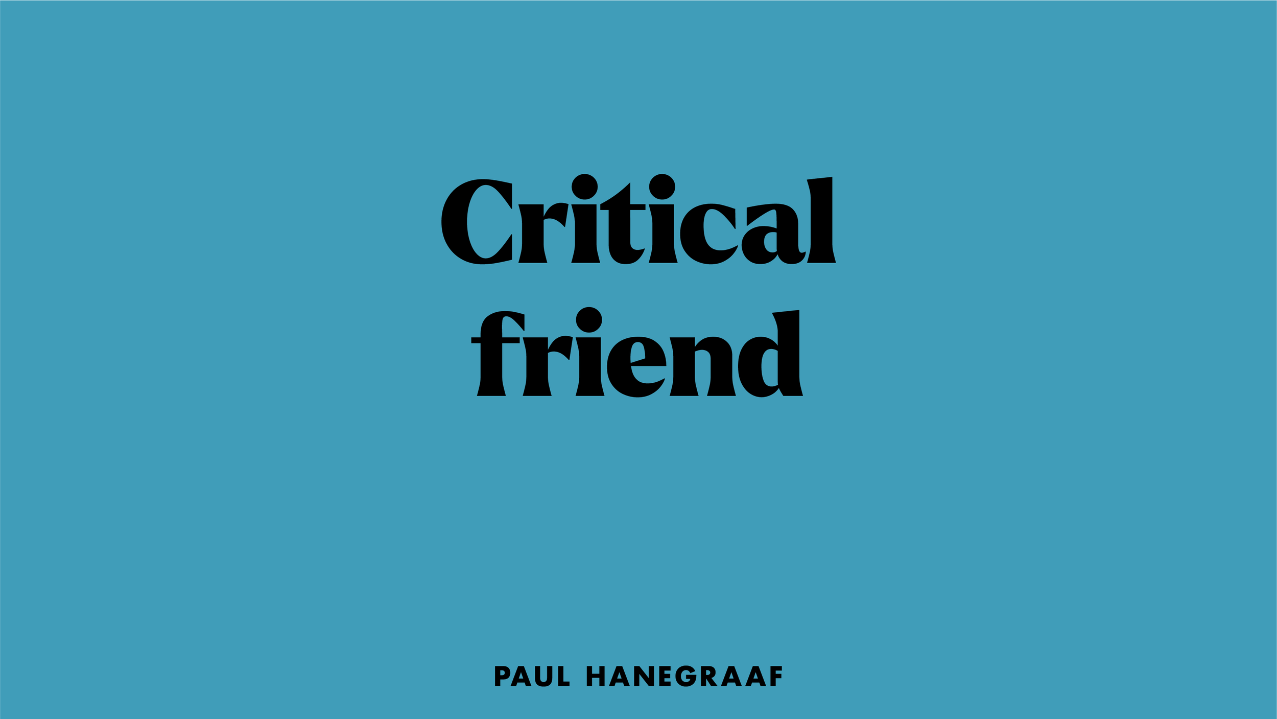
A man with a deeply unique outlook on life. A man who continues to make permanent impressions wherever he goes. A man with such a huge collection of wise words that we quite literally made our own dictionary of Paul-isms.
We’ve channelled bold colours, typography, and scale-capturing imagery into a brand that proudly reflects this truly one-of-a-kind mind.
Meaning in making
Marrying together the bold colour palette and playful Paul-isms we created an identity unique to Paul’s tone-of-voice.


A distinct voice across all platforms
The design language of the new identity allowed us to create a flexible system that works across all platforms, bringing the distinct look to all touch points of the brand.


Playful expression
The bold typography and colour palette allowed us to create a visually rich set of merchandise, and printed materials for Paul to share his identity with the world.


Stepping into the world of Paul
To bring harmony to the bold colours we worked to create a cinematic approach to the photographic elements of the brand – playing with scale and texture to further enhance the feel of the brand.